ON THE HOOF


Screen Shot 2014-11-24 at 14.12.56

Ela from On The Hoof, a small, Local chain of coffee shops in London told us she was talking about taking over this old opticians in Sydenham to open up a bistro. We were excited by this and she asked if we could help out with the shop front. It was a challenge with the rather dilapidated roller shutter and shop front and oversize signage. We came up with a number of different designs, some based on some lovely stained glass signs they had in the shop which they sadly never used. The inside is very up-cycled and eclectic, so we tried to bring some of that to the exterior. They didn’t use the designs in the end, but we thought we would share some of the various designs we produced.

It’s a fantastic bistro and very popular since it opened. Its wonderful inside and the food is absolutely top notch. It’s great to have such an exciting new business in Sydenham.

Screen Shot 2014-11-24 at 14.36.24

ON THE HOOF DESIGNED BY GOOD PEOPLE

Screen Shot 2014-11-24 at 14.13.07

Screen Shot 2014-11-24 at 14.12.50

THE GREYHOUND MURAL LATEST


GREYHOUND MURAL DESIGNED BY GOOD PEOPLE

The Greyhound mural is finally installed, although no-one told us and you can’t see it! The building hasn’t been finished and is derelict, but strangely the mural has been installed and is covered in scaffolding. We were contacted by the South London Press about the mural and made it to the front page!

View original post 174 more words

WHAT IF no 24: KIRKDALE GHOST SIGNS


Kirkdale has two distinct areas separated by a long residential area. Many people don’t know the top part is still part of Kirkdale.

Could this grey wall could be put to better use?

KIRKDALE JH SKINCARE before

But what if:

KIRKDALE JH SKINCARE after

Well, we did. The above is a visual. This is the finished sign:

KIRKDALE SIGN 2 (JH)

And here is the signwriter, Peter O’Connor lovingly applying his craft.
PETER OCONNOR SIGNWRITING KIRKDALE

The full story can be found HERE.

Local reaction to the signs can be found HERE.

WHAT IF no 23: LA TIENDA


LA-TIENDA-WHAT-IF-new

Sydenham has a deli. The owners are really nice and we piped in a little while ago to ask if we could help them. It always seemed a bit quiet and normally deli’s get people talking (like this one we did earlier).

This is what it looks like now…

LA TIENDA BEFORE

But what if:
LA TEINDA AFTER

Chalk boards with single offers on them (just painted marine ply boards, very cheap), cover the stall risers in some dark blue brick tiles and some simple signage and cleaning up the top of the building can make a huge difference for little cost. They could upgrade this and get the panel between the windows digitally printed onto tiles (as we are doing with the Greyhound Mural).

LA TIENDA LOGO

You can read more feedback on the Sydenham Forum. So far all the comments have been great!

WHAT IF 22: CLASSIC TROPHIES


Another shop that we spoke to after speaking at a local traders association meeting.

CLASSIC TROPHIES BEFORE & AFTER

CLASSIC TROPHIES AFTER_2

We had never been in the shop before and it’s rather beautiful with lots of original features. I’d implore anyone living in Sydenham to pop in and have a look, it’s an absolute local treasure.

The outside doesn’t really do it justice. The shop front is nice with a traditional awning. It’s actually two shops in one.

Making the shop front calmer and making it feel like it’s been around a long time while acting as a frame for the window displays also makes the shop name stand out. For the trophy signage this would look great if gilt and engraved. The awning is a great opportunity to show that there are two shops in one, which is why it has the large ampersand.

So from purple to sophisticated shop with original features. What if…

UPDATE: you can read more feedback on the SYDENHAM TOWN FORUM.

WHAT IF NO 21: BARAKAH


We were approached by the owners of Barakah after giving a talk at a local traders group to look at their shop front.

BARAKAH BEFORE & AFTER

We got one of their mailers through the door a long time ago and were seduced by it’s uncoated paper and smart black and orange livery. It felt quality, something rather different to the usual glossy, over complicated rubbish that falls through our letterbox. We kept the menu and when the food turned up we were pleased to note that the quality of the food matched the expectation.

It was some while later when we realised that the place we were ordering from was a 5 minute walk from our front door and looked nothing like any of the marketing material that they were sending out.

So the job here would be simple. Make their shop look like the brand they send out to thousands of homes in the area and make it reflect the surprisingly good quality food that they send out. So we have used their logo and colours.

A bit of black paint, a re-skinned light box in black and orange and some new window vinyls and black brick tiles to tidy up the stall risers can make a huge difference.

Before it looked tired and didn’t match their brand. But What If…

If you haven’t tried them, give them a go: http://www.barakah-se26.co.uk

UPDATE: you can read more feedback here on the SYDENHAM FORUM.

WHAT IF NO 20: STATION APPROACH


STATION APPROACH

Originally there would have been some painted signs on this building. When I first came to Sydenham I didn’t notice the station was down there. There are no signs to announce that you are in Sydenham.

We love the idea of art being relevant or functional in some way.

STATION APPROACH_2 panel

STATION APPROACH_2

Sydenham is getting an expensive makeover of station approach and On The Hoof, our new rather fab station cafe with seating outside. It makes sense to celebrate this in some way. It also makes sense to advertise Sydenham’s great transport links now we have the Overground.

We have had this idea for a while now and presented it to the SEE3 group as funding is available for signage in Sydenham, Forest Hill & Kirkdale. We are also advisors for the GLA (Greater London Authority) who are supplying the funding (we are designing this for free, as all the ‘What If Sydenham’ projects have been, this costs US money!).

We also included a visual for Property World’s ‘panel’. We normally approach business before we do this sort of thing, but this time we thought we would do it the other way around (we hope they don’t mind, but it gets them some free feedback). Property World are very active locally and support out local arts festival and the ‘Arts in The Park’ in Home Park (which we also support with free design work). We understand that PW actually rent the advertising space but for ages just had one of their plastic ‘LET’ boards in there for a property that was no longer on the market. They kindly took it down after we posted on a local forum kindly asking them to remove it, which they did (we gave them a bottle of champagne as a thank you) which shows that they are very community minded.

The idea is that we would create a retro version of their logo so it looks like it’s been there for ages. This makes them feel part of Sydenham and have been long established in the area, which is true. We did something similar in North Harrow where we designed a logo for the area but then created a retro version of it, which we painted on the side of a building.

NORTH HARROW LOGO
The logo

SAM_0029
The Ghost Sign

So their current logo looks like this:
PROPERTY WORLD

On the building the retro version would look like this:
PROPERTY WORLD SIGN

We could get it distressed (as with the visual) or add the dat the business was started. we don’t think it should be a sponsored ‘Welcome to Sydenham sign’, they can be a bit tacky and are not what would have been on the building originally.

We are still waiting to hear from SEE3 on how the money will be spent but Cllr Chris Best and the team were really positive about it. Hopefully, as SEE3 and Especially Cllr Best have championed art in Sydenham in recent years with her backing to the Mosaic on the Naborhood Centre and the new Street art festival, we hope that this will get the go ahead too.

You can read the feedback and comments from the Sydenham Forum here.

WHAT IF SYDENHAM HAD A CINEMA


Image of the amazing Electric Cinema in Portabello Road


The Film Mill have posted on the Sydenham Forum about bringing a community based Cinema to Sydenham.

What a brilliant idea. See more here.

They have a survey, please have a look.

What do you think? And where would it be?

What did you say on the survey?

WHAT CAN HIGH STREETS LEARN FROM SHOPPING MALLS?


LEEDS MALL

High streets are important, both for community and for place. They help define an area as being more than a collection of homes, but over time many they have lost their way, and yet shopping malls wouldn’t be around today if it wasn’t for the high street.

View original post 3,503 more words

UPDATE ON THE GREYHOUND WALL MURAL


Greyhound Mural Designed By Good People

Greyhound Mural Designed By Good People

It’s taken an age to process all the images, crop them and make them work with the image which we had to amend as many colours simply didn’t work with the image (which wis why the Greyhound now proudly stands in a wildflower infused meadow in inject some much needed colour into the work. We have a lot of B&W images which we had to tweak colourwise to tones of sepia etc so they worked with the image. The image was also tweaked to work better from an angle than straight on as the space in which is will be viewed will be seen more at an angle than flat on. We are getting closer.

This is the close up:
Greyhound_13x5_Mazaika_Test3_Close_up

There is still a lot of work to go to eliminate as many repeats as we can. This job is costing us a fortune in time and money!

Have a good weekend.

‘JILL’ POP UP SHOP


JILL SIGN
Saturday saw the launch of the pop up shops in Sydenham, Kirkdale and Forest Hill.

We have been helping with the design of the signage, all of which was done on a shoestring budget. The letters came to £145 fixed onto a marine ply backboard and then painted black. As will all shops, it has the number (it drives us mad when shops don’t do this!).

This is the ‘Jill’ hub (originally there were to be 3 ‘hubs’, we suggested they be called Tom, Dick & Harry, but when three became two they changed to Jack & Jill… with Jack further up the hill in Forest Hill).

This is the before:
JILL BEFORE (match)

This is the design visual:
JILL SHOP AFTER

This is the installed sign:
JILL AFTER (finished)
(there is still a bit of painting to do!)

There is a lot going on in Forest Hill and Sydenham at the moment. Check out www.see3.co.uk for more details.

The Jill sign was installed by Rushworth Carpentry

BE PART OF THE GREYHOUND WALL ARTWORK


This is the winning artwork that will appear on the rear wall of the Greyhound Pub.  It is an image of a Greyhound made up of images of Sydenham. TO MAKE IT WORK WE NEED YOUR IMAGES.

  • They can be anything to do with Sydenham. Old photos, family photo’s, landscapes, artworks, doodles, images of parks, places, people…anything Sydenham related
  • There is no limit to the amount of images you can send in
  • They need to be supplied digitally as high a resolution as possible. They’ll be cropped square (around 10cm x 10 cm)

You’ll need to submit the images by the 8th of October 2012 to: greyhoundwall@gmail.com

You’ll need to fill in this disclaimer online, please don’t forget  to do this before  submitting your images:

http://greyhoundwall.wufoo.com/forms/greyhoundwall-image-submission-form/

GREYHOUND WALL COMPETITION


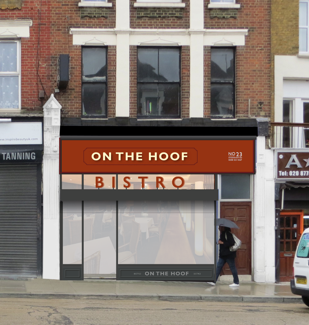
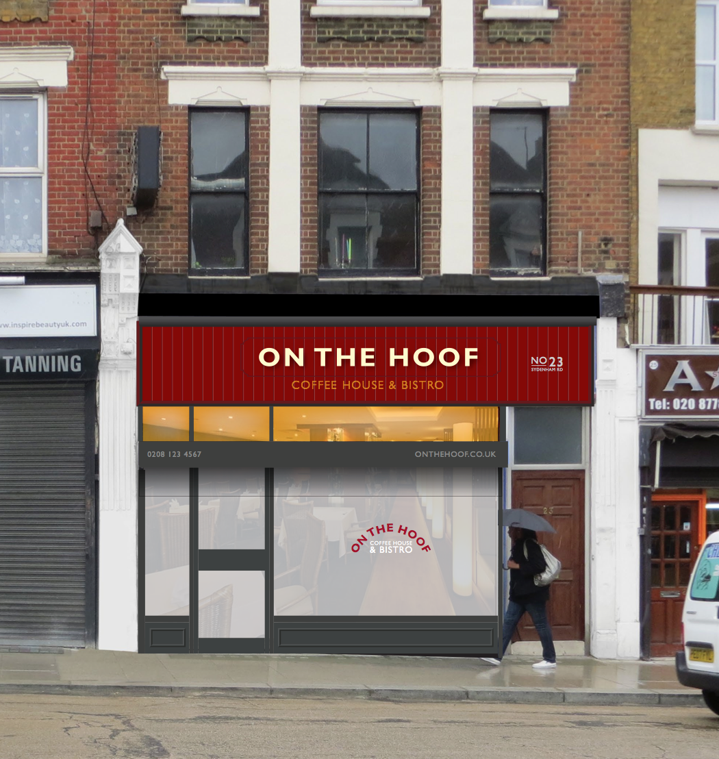
The Greyhound Pub in Sydenham has been empty for a few years and is now being developed. A competition has been run to add some public art to the rear wall of the pub. There were 60 entries in total. Our entry
is this:

Please note, this isn’t the final design, it’s still a work in progress.

We found out on Monday evening that we won. We are very excited by this and will keep you all updated as to the progress.

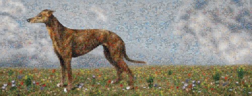
THE GREYHOUND & SYDENHAM IN PIXELS:

Each tile is one pixel. Each pixel is one image supplied by the people of Sydenham. They will be images of people, historical figures, illustrations, art, places, family photo’s, events photos, etc.

All the images together will make up the image of the greyhound seen below, which is based on historical images of the sign for The Greyhound pub.

When you get close you get to see the detail and the individual pixels, from a distance (3-5 m, the width of the passageway should give you a good view of the whole image) you see the greyhound.

The idea is to give people a sense of ownership and pride in Sydenham, to celebrate the present, past and future. Everyone who participates will have their name in a plaque shown on the right that also shows the history of
The Greyhound.

The windows can be covered with the same see through window film they use on London Buses to continue the tiles across the glass.

We have also designed a hanging pub sign for the back of the pub.

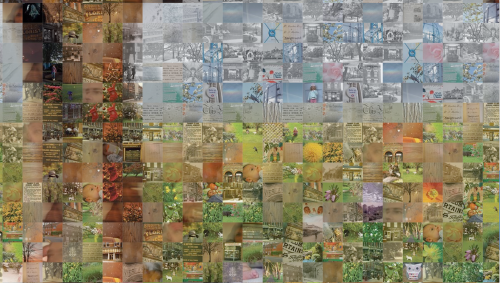
This image is a visual and doesn’t not contain the final images. These are yet to be collected.

Many thanks to our Intern, Sandra for all her hard work on this.

We will be collecting images for the wall about Sydenham. They can be of local art, family photo’s, history, famous people, old pictures, places around sydenham and events etc. We will include the other entries into the competition into the design so they will all be on the wall.

Each image will have to be square, 10cm x 10cm at 350dpi.

More details about how and where to send your images to follow shortly.

There is some feedback to the competition on the Sydenham Forum, which, despite the initial review has been incredibly positive.

Designed By Good People

WHAT IF 19: EMPTY PUBS


This use to be a carpet shop.

Then, a number of years ago, it opened as the Pukka Bar, an upmarket indian restaurant. It had a refit that cost £250,000 but really opened in Sydenham about a year early before the gastro pub and cafes opened. It lasted 6 months (the place inside is vast). The interior refit is of a very high quality and remains. The pub that took over from the Pukka bar doesn’t.

We hope the interior will remain, but if the pub is going to be renovated or left, why leave it like this:

What if:

A simple printed hoarding. The door would be indicated by the dotted line.

Obviously this is a transferable design. Whoever is taking over the property can announce it on the stamp on the front of the box.

Have a look at the other What If’s on empty shops here:
WHAT IF 18
WHAT IF 17
WHAT IF 16

WHAT IF 18: EMPTY PUBS


Lots of people hated the gramatical error in the name of this pub. We found it rather charming. Which isn’t what can be said about the pub or the building which wasn’t the nicest place to be. Which may be one reason why it’s now closed.

But thats’ still no excuse to leave it in a state. It’s not making the building any more attractive.
It currently looks like this:

But What If:

Here is a close up.

If we get to do it we will work on it a little more and make it look like everyone is enjoying a drink.

This is a simple ‘street art project’, the wooden windows would be stencilled with the famous faces as if they are enjoying a drink in the bar.

More to come…

WHAT IF 17: EMPTY SHOPS


This is another idea for the empty buildings by Sydenham Station that currently look like this:

But what if:

The vending machines etc would be working which would add a bit of interaction to a building that hasn’t interacted with the public for years. The backboard would be made of planks, hidden doors could be made if access to the building is needed. The type is signwritten on the wood except the sign at the top which would be individually cut letters.

It could easily be adapted to other sites, to different types of shops and be a lot of fun.

See also the previous version

WHAT IF 16: EMPTY SHOPS


Years ago this place was Sydenham Station but it was knocked down them they moved the platform.

It currently looks like this:

One of the best shops in Sydenham is two doors away. The Kirkdale Bookshop.
What if:


Continue reading ‘WHAT IF 16: EMPTY SHOPS’

FOREST HILL, SYDENHAM & KIRKDALE MARY PORTAS VIDEO


We totally support this… & we are in it.

Please support the bid by liking the video on You Tube.

WHAT IF SYDENHAM


Once upon a time shops would look proud of themselves. Sydenham road was actually beautiful. Shop owners would stand outside of their shop with a look of pride on their faces. Goods would be beautifully displayed. Signwriters, signmakers and glass cutters (these were generally from the area, all had their own styles and would help give an area it’s own visual identity) would make the most humble of businesses beautiful.

These shops aren’t exclusive boutiques. They simply believed in enticing people into the shop by making their store as attractive as possible. They had pride in their appearance. Even a humble dairy or fruit and vegetable shop. They were beautiful.

Some shops were so proud of where they were, they put the name of the road on the shop. We did this with Billings. Most shops these days don’t even put the number on the shop front. We think they should by law.

Today Sydenham Road is pretty shabby. Compare the above with the same road today:


Much as we love Mustis above (which is what everyone calls the store) the signs hasn’t changed for years, it pre-dates the current owners (Musti is one of the friendliest shore owners in Sydenham). Garam Masala have put tiles more suited to a toilt on the outside which is totally out of keeping with the building.

Many people say this is a great dry cleaners. We use another one, despite this one being cheaper and nearer to us. It doesn’t look like it will do a good job. For months they actually had a mouldy wedding dress in the window. IN 4 years they haven’t cleaned the shop front or cleared the tags off the roller shutters.

If you take over a business, invest in new signage. Spraypainting over the old name is not going to win you any customers! It makes me question how they treat the food if they think this is acceptable.

The sign on the right broke one windy night over 2 years ago. They still haven’t fixed it. I’m not sure what that says about what they sell or customer service. To us it makes the shop look like it doesn’t care. It’s interesting historically though!

The sad fact is that it’s cheaper to repaint an original shop front than rip it out and install a new one. Quality signage and signwriting isn’t that expensive.

So shops in Sydenham currently look like this:

But what if:

Same shops, same shop fronts, same prices. Just new signage, awnings and a bit of paint.

Which one would you rather shop in? Which one gives you a better impression of the high street, customer service and quality?

www.designedbygoodpeople.wordpress.com
www.whatifhayes.wordpress.com
www.whatifpenge.wordpress.com
www.whatifilfracombe.wordpress.com

2011 in review


The WordPress.com stats helper monkeys prepared a 2011 annual report for this blog.

Here’s an excerpt:

A New York City subway train holds 1,200 people. This blog was viewed about 7,300 times in 2011. If it were a NYC subway train, it would take about 6 trips to carry that many people.

Click here to see the complete report.


Archives