Posts Tagged '1. WHAT IF: DESIGN view makeovers here'

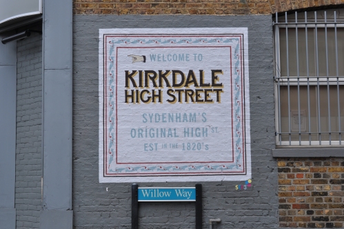
WHAT IF no 24: KIRKDALE GHOST SIGNS


Kirkdale has two distinct areas separated by a long residential area. Many people don’t know the top part is still part of Kirkdale.

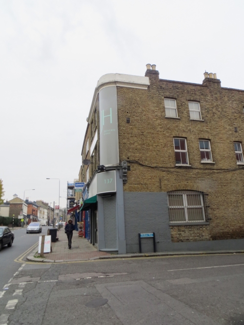
Could this grey wall could be put to better use?

KIRKDALE JH SKINCARE before

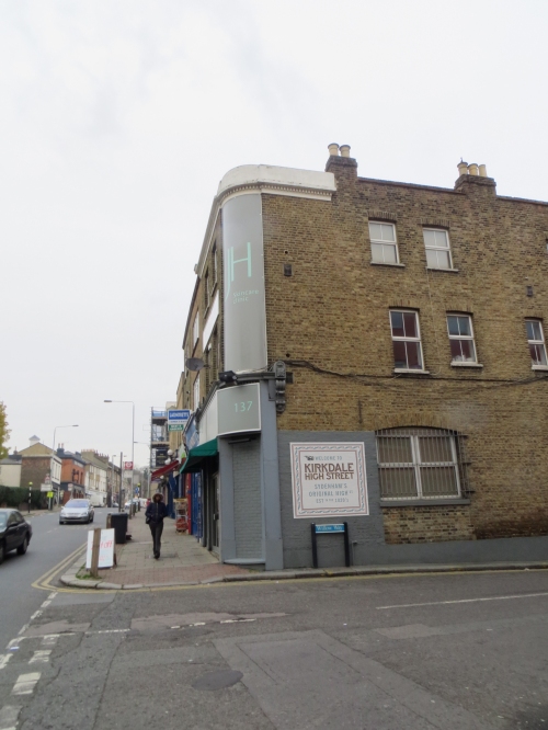
But what if:

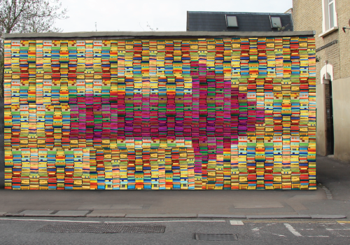
KIRKDALE JH SKINCARE after

Well, we did. The above is a visual. This is the finished sign:

KIRKDALE SIGN 2 (JH)

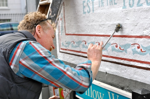
And here is the signwriter, Peter O’Connor lovingly applying his craft.
PETER OCONNOR SIGNWRITING KIRKDALE

The full story can be found HERE.

Local reaction to the signs can be found HERE.

WHAT IF 22: CLASSIC TROPHIES


Another shop that we spoke to after speaking at a local traders association meeting.

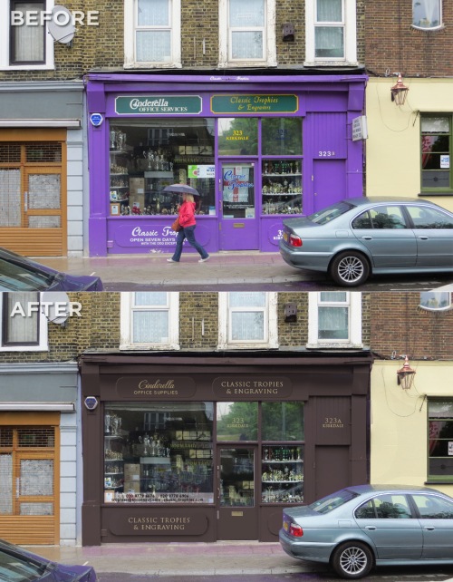
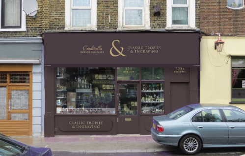
CLASSIC TROPHIES BEFORE & AFTER

CLASSIC TROPHIES AFTER_2

We had never been in the shop before and it’s rather beautiful with lots of original features. I’d implore anyone living in Sydenham to pop in and have a look, it’s an absolute local treasure.

The outside doesn’t really do it justice. The shop front is nice with a traditional awning. It’s actually two shops in one.

Making the shop front calmer and making it feel like it’s been around a long time while acting as a frame for the window displays also makes the shop name stand out. For the trophy signage this would look great if gilt and engraved. The awning is a great opportunity to show that there are two shops in one, which is why it has the large ampersand.

So from purple to sophisticated shop with original features. What if…

UPDATE: you can read more feedback on the SYDENHAM TOWN FORUM.

WHAT IF NO 21: BARAKAH


We were approached by the owners of Barakah after giving a talk at a local traders group to look at their shop front.

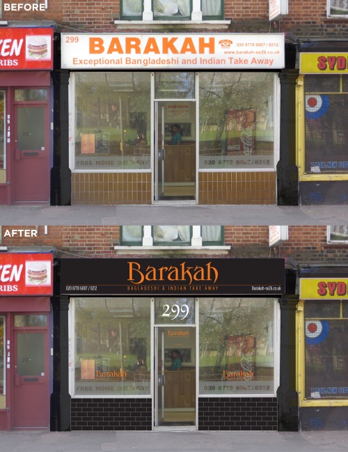
BARAKAH BEFORE & AFTER

We got one of their mailers through the door a long time ago and were seduced by it’s uncoated paper and smart black and orange livery. It felt quality, something rather different to the usual glossy, over complicated rubbish that falls through our letterbox. We kept the menu and when the food turned up we were pleased to note that the quality of the food matched the expectation.

It was some while later when we realised that the place we were ordering from was a 5 minute walk from our front door and looked nothing like any of the marketing material that they were sending out.

So the job here would be simple. Make their shop look like the brand they send out to thousands of homes in the area and make it reflect the surprisingly good quality food that they send out. So we have used their logo and colours.

A bit of black paint, a re-skinned light box in black and orange and some new window vinyls and black brick tiles to tidy up the stall risers can make a huge difference.

Before it looked tired and didn’t match their brand. But What If…

If you haven’t tried them, give them a go: http://www.barakah-se26.co.uk

UPDATE: you can read more feedback here on the SYDENHAM FORUM.

WHAT IF 19: EMPTY PUBS


This use to be a carpet shop.

Then, a number of years ago, it opened as the Pukka Bar, an upmarket indian restaurant. It had a refit that cost £250,000 but really opened in Sydenham about a year early before the gastro pub and cafes opened. It lasted 6 months (the place inside is vast). The interior refit is of a very high quality and remains. The pub that took over from the Pukka bar doesn’t.

We hope the interior will remain, but if the pub is going to be renovated or left, why leave it like this:

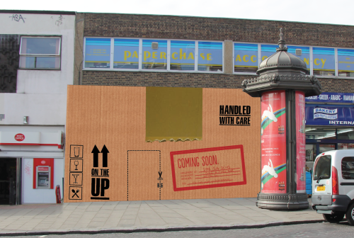
What if:

A simple printed hoarding. The door would be indicated by the dotted line.

Obviously this is a transferable design. Whoever is taking over the property can announce it on the stamp on the front of the box.

Have a look at the other What If’s on empty shops here:
WHAT IF 18
WHAT IF 17
WHAT IF 16

WHAT IF 17: EMPTY SHOPS


This is another idea for the empty buildings by Sydenham Station that currently look like this:

But what if:

The vending machines etc would be working which would add a bit of interaction to a building that hasn’t interacted with the public for years. The backboard would be made of planks, hidden doors could be made if access to the building is needed. The type is signwritten on the wood except the sign at the top which would be individually cut letters.

It could easily be adapted to other sites, to different types of shops and be a lot of fun.

See also the previous version

WHAT IF 16: EMPTY SHOPS


Years ago this place was Sydenham Station but it was knocked down them they moved the platform.

It currently looks like this:

One of the best shops in Sydenham is two doors away. The Kirkdale Bookshop.
What if:


Continue reading ‘WHAT IF 16: EMPTY SHOPS’

Trumpet Blowing


Image from Creative Commons on Wikipedia.

The What If Sydenham project has gained a fair amount of exposure around the world since we started it a few years ago. Aside from the Sydenham Forum where we have posted all of the What If Projects, it’s appeared all over the internet.

Here are a few links.
Aside from a mention on the Guardians website,
the project has also appeared here: Continue reading ‘Trumpet Blowing’

THE WAY WE WERE


From Lewisham Libraries archives

We love old pictures of high streets.

The shop fronts were well designed and looked like they belonged to the building. Most shops had awnings. Typography and signage was well designed and crafted by people who worked long apprenticeships to learn their trade. Often these people lived locally and this helped to give an area a particular look, a local distinction.

These days many shop fronts are installed without much thought to the building or the locality with the view that standing out, being different and shouting as loudly as possible is a good thing.

It isn’t.

If everyone shouts you can’t hear anything.

We think we have something to learn from the past. That doesn’t mean make something look old. We mean make something look well designed. Fit for the area. Make the area look distinctive in it’s own right rather than making it look like it could be from anywhere. High streets are a supermarket under many roofs. They should feel cohesive as a whole rather than individual shops fighting one another. They need to work together.

Designed by Good People started the What If Project a few years ago. It’s helped raise the profile of shop front design and we are embarking on our second actual makeover soon. Hopefully the next chapter is about to open. Hopefully there will be exciting times ahead. Hopefully we can make a difference.

Designedbygoodpeople.com

WHAT IF no 15: HOUSE OF LINENS


We popped into ‘House of Linens’ a little while ago to get a few bits and pieces (we are going eco and are now fixing old clothes and buying ‘vintage’) and met the very friendly owner. He was talking about Billings so we told them about the What if Sydenham Project.

He looked all excited and rushed us outside to look at this sign which he wants to redo. We have been really busy and the few times we have had chance to pop by we haven’t seen him in the store. So before we show them what we have come up with I thought it best to get some feedback on this.

So here goes:

What if:

OPTION 1a

More sophistcated colours, the ‘stitched’ logo is on a raised enamel panel (about £400) on a wooden background with Vinyl applied lettering in gloss to make them look as if they are hand painted. The security grill and door etc have been painted to match the sign.

We aren’t sure when the business started trading in Sydenham but it’s been here a long time and the owners wanted to communicate this, hence the ‘trading since ’92’.

OPTION 1b

Or we could add an awning and raise the sign above. The awning costs about £1300.

OPTION 2

The sign is based on a fabric swatch with the turned corner in a shocking pink to catch the eye. Again the design is retro with a twist and uses more sophisticated colours.

So which one feels the most like a small, family run, haberdashery that has been trading locally for many many years?

If you comment please say if you use House of Linens.

For more feedback visit the Sydenham Forum or VIrtual Norwood.

designedbygoodpeople.com
WHAT IF no14: FRESH & FRUITY


Fresh and Fruity are linked to Billings (What if No 13) as they are Amo’s parents. Infact without their help, and the help of Annabel and Tim from the Sydenham society Billings may never have happened.

Since then we have been incredibly busy and the What If Project has taken a back seat, despite lots of local businesses asking for their makeovers. Unfortunately we have to pay the bills as we fit these in when we can!

We have been promising this for a while, so I though I’d post it here, get some feedback before presenting onto them. It’s been a while in the making!

This is what the shop looks like now:

FRESH & FRUITY before


Continue reading ‘WHAT IF no14: FRESH & FRUITY’

WHAT IF no12: THE CINEMA IN CRYSTAL PALACE…


This is what the cinema currently looks (we took a few liberties by photoshopping out the cars and people walking by). It’s a very busy road.

BEFORE:

BUT WHAT IF…


Continue reading ‘WHAT IF no12: THE CINEMA IN CRYSTAL PALACE…’

LEWISHAM DO HAVE GUIDELINES FOR SHOP FRONTS


http://www.lewisham.gov.uk/Environment/Planning/PlanningPolicy/LocalDevelopmentFramework/ShopFrontDesignGuide.htm

And they are good!
Continue reading ‘LEWISHAM DO HAVE GUIDELINES FOR SHOP FRONTS’

WHAT NOT TO CALL YOUR BUSINESS!


This is a bit of Friday Fun.

I got this on an email from an architect friend.

A great example of what NOT to do to your shop fronts.

ATT00013

ATT00002
Continue reading ‘WHAT NOT TO CALL YOUR BUSINESS!’

GREENING THE NABOURHOOD CENTRE


http://i7.photobucket.com/albums/y274/leenewham/avignon.jpg

Just thought I’d throw this out there for comment. If the Nabourhood centre was covered in the green wall system it would cost between £450 to £600 per m2 (I’ve contacted some companies). I roughly estimate that the nabourhood centre is between 40-50m2 that needs covering. So it will cost between £18,000 to £30,000 to use the green wall system on the nabourhood centre. It reduces heat loss and helps keep buildings cook in the summer. It reduces noise. It’s VERY low maintenance. It stops graffiti. It doesn’t need painting. It encourages butterflies etc. It doesn’t damage the building. I know I’m going got get stick from some quarters which I’m fine with because of the Mosaic, which I disagree with (but I think Valerie has done an admirable job in bringing it to the stages of reality). I simply think it’s worth investigating an alternative. If we think it’s worth pursuing this I will. What do you think? Should I pursue it further?

WHAT IF no9: MUSTI’S PART DEUX


This is a sketch (the shapes and pig need refining but you get the idea) for Mustis new sign now that he has his new shop front. We we able to go inside the shop before it was renovated and it has the original ceiling roses from the original light fittings above the false ceiling and the original wooden floor that started in  the middle of the front window where the original door would have been. unfortunately the floor is now concreted over. It would have been great to have revealed the original features in the refit but hopefully they are untouched and safely covered by a new false ceiling.

We have looked at Musti’s before and it generated some interest (it’s how we got to meet the man himself, and what a nice guy he turned out to be).

So here is the latest…complete with pig.

BEFORE

Musti's, as it is today.

Musti's, as it is today.

But what if…

I drew the pig rather quickly, it's just a rough. Needs some polish...

I drew the pig rather quickly, it's just a rough. Needs some polish...

It is possible to put graphics on roller shutters. I’m not a huge fan of them normally.

So what do you think?

WIS.

Some good feedback for this one the Sydenham Forum:

http://alturl.com/qufd

IF YOU LIKE THIS, PLEASE TELL PEOPLE ABOUT IT!

Designed by Good People
www.designedbygoodpeople.com

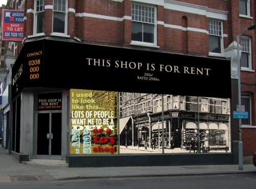
WHAT IF no8: OUR EMPTY SHOPS LOOKED LIKE THIS


Empty shops are a blight on any high street (although sales of window polish go up).

W.I.S. Thinks that owners of empty shops should be forced to ensure that they are presented in an acceptable way. It’s a great opportunity to have art displayed, local history, or as in the case of this ad, history AND an advertisement. Everyone seems to hate those triangular boards stuck above shops saying ‘shop to let’.

The old curtain shop currently looks like this:

SAD, DEPRESSING, BORING, UNLOVED

SAD, DEPRESSING, BORING, UNLOVED

So how can we take something that is a blight on the high street and turn it into something positive?

What if it looked like this:

POSITIVE, PRETTIER, UNIQUE TO THE AREA

POSITIVE, PRETTIER, UNIQUE TO THE AREA


Continue reading ‘WHAT IF no8: OUR EMPTY SHOPS LOOKED LIKE THIS’

WHAT IF no7: LADY METROS BECOMES GIFT BOX


I don’t know much about this new store except it sells gifts.

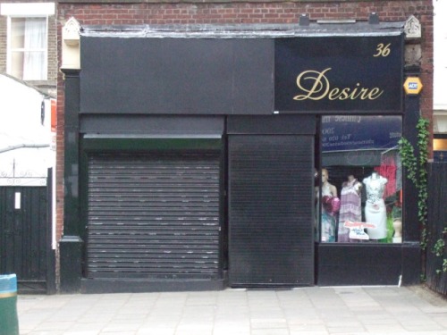
I guess most people know very little about it as it doesn’t have a sign. When the shutters are shut it doesn’t even look like it’s a business.

This is what it currently looks like:

The shop without a face

The shop without a face

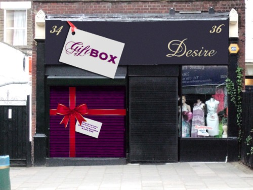
I presume that once this was once one shop. I think it would be wise to live in harmony with Desire next door and make the sign one colour. Otherwise it’s a bit like those houses that try too hard to be different from their neighbours and you get a drainpipe painted in two different colours.

One other pet hate of mine are roller shutters that completely cover the front of the shop. They make high streets look like prisons. But you can turn a negative into an advantage by painting it.

So a shop without a sign becomes giftbox…

And how it could look

And how it could look


Continue reading ‘WHAT IF no7: LADY METROS BECOMES GIFT BOX’

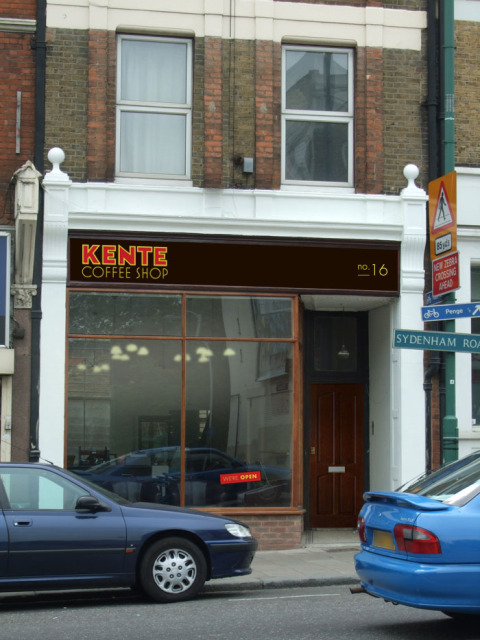
WHAT IF no6: KENTE COFFEE SHOP


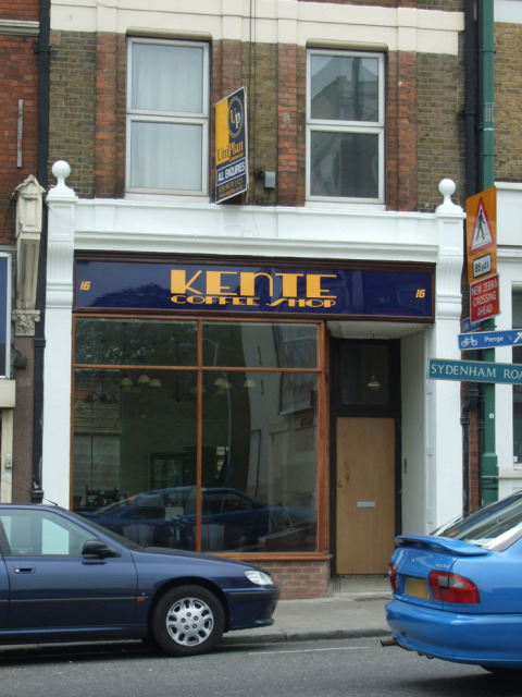
Kente is a great little coffee shop in the high street. We are lucky that we now have a few good places to go (although I wish some were open late!).

When I posted the original Deli what if it caused quite a lot of debate which led to calls for Kente to change it’s sign.

This is what Kente looks like at the moment:

Kente before makeover.

Kente before makeover.

It’s blue and yellow signage look more appropriate for estate agents sign that sits above the shop.

Look inside Kente and you will find old travel posters like these:

TRAVELPOSTERS

The lights inside have an art deco feel to them.

So I’ve picked up on some of these visual cues with the type. Colours are warm and inviting golds and reds on a roasted brown background which are colours more associated with coffee. Look at coffee packaging and a majority of it uses browns, blacks, reds and golds/yellows.

The sign would be better on wood rather than the shiny plastic background currently used.

Which could look something like this:

Stage 1

Stage 1

Colours are adjusted (background of sign is very dark ‘roasted brown’), logo is gold with deep rich red-ish brown type for kente. Type is adapted from some type on old travel posters, hand drawn bespoke for this, it’s not just a font!
Continue reading ‘WHAT IF no6: KENTE COFFEE SHOP’

WHAT IF no5: The HSBC became a Thai Restaurant


I don’t know about you, but I’m sick of seeing such a prominent building lay disused for so long.

I don’t know if its possible to open it as a food outlet. We have a few places to eat in the evening, but compared to some places it’ is a bit limited.

I love a good Thai, and generally I go to them in central London. The Thai restaurant near where I used to live in New Cross was incredibly busy, so what if this…

THE HSBC 2009

THE HSBC 2009

Becomes something like this…

THAIPADHSBCAFTER

One other thing, in the background you may notice the wall has an old advertising sign for Cobbs corner on it on the new picture. What if we could ‘recreate’ some of these old painted ad/murals around Sydenham for businesses past and/or present.

MORE FEEDBACK CAN BE FOUND ON THE SYDENHAM FORUM


Archives