Posts Tagged 'branding'

WHAT IF 17: EMPTY SHOPS


This is another idea for the empty buildings by Sydenham Station that currently look like this:

But what if:

The vending machines etc would be working which would add a bit of interaction to a building that hasn’t interacted with the public for years. The backboard would be made of planks, hidden doors could be made if access to the building is needed. The type is signwritten on the wood except the sign at the top which would be individually cut letters.

It could easily be adapted to other sites, to different types of shops and be a lot of fun.

See also the previous version

WHAT IF SYDENHAM


Once upon a time shops would look proud of themselves. Sydenham road was actually beautiful. Shop owners would stand outside of their shop with a look of pride on their faces. Goods would be beautifully displayed. Signwriters, signmakers and glass cutters (these were generally from the area, all had their own styles and would help give an area it’s own visual identity) would make the most humble of businesses beautiful.
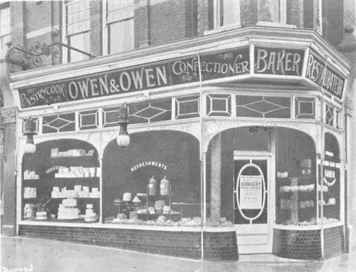
These shops aren’t exclusive boutiques. They simply believed in enticing people into the shop by making their store as attractive as possible. They had pride in their appearance. Even a humble dairy or fruit and vegetable shop. They were beautiful.

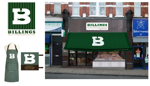
Some shops were so proud of where they were, they put the name of the road on the shop. We did this with Billings. Most shops these days don’t even put the number on the shop front. We think they should by law.

Today Sydenham Road is pretty shabby. Compare the above with the same road today:


Much as we love Mustis above (which is what everyone calls the store) the signs hasn’t changed for years, it pre-dates the current owners (Musti is one of the friendliest shore owners in Sydenham). Garam Masala have put tiles more suited to a toilt on the outside which is totally out of keeping with the building.

Many people say this is a great dry cleaners. We use another one, despite this one being cheaper and nearer to us. It doesn’t look like it will do a good job. For months they actually had a mouldy wedding dress in the window. IN 4 years they haven’t cleaned the shop front or cleared the tags off the roller shutters.

If you take over a business, invest in new signage. Spraypainting over the old name is not going to win you any customers! It makes me question how they treat the food if they think this is acceptable.

The sign on the right broke one windy night over 2 years ago. They still haven’t fixed it. I’m not sure what that says about what they sell or customer service. To us it makes the shop look like it doesn’t care. It’s interesting historically though!

The sad fact is that it’s cheaper to repaint an original shop front than rip it out and install a new one. Quality signage and signwriting isn’t that expensive.

So shops in Sydenham currently look like this:

But what if:

Same shops, same shop fronts, same prices. Just new signage, awnings and a bit of paint.

Which one would you rather shop in? Which one gives you a better impression of the high street, customer service and quality?

www.designedbygoodpeople.wordpress.com
www.whatifhayes.wordpress.com
www.whatifpenge.wordpress.com
www.whatifilfracombe.wordpress.com

THE WAY WE WERE


From Lewisham Libraries archives

We love old pictures of high streets.

The shop fronts were well designed and looked like they belonged to the building. Most shops had awnings. Typography and signage was well designed and crafted by people who worked long apprenticeships to learn their trade. Often these people lived locally and this helped to give an area a particular look, a local distinction.

These days many shop fronts are installed without much thought to the building or the locality with the view that standing out, being different and shouting as loudly as possible is a good thing.

It isn’t.

If everyone shouts you can’t hear anything.

We think we have something to learn from the past. That doesn’t mean make something look old. We mean make something look well designed. Fit for the area. Make the area look distinctive in it’s own right rather than making it look like it could be from anywhere. High streets are a supermarket under many roofs. They should feel cohesive as a whole rather than individual shops fighting one another. They need to work together.

Designed by Good People started the What If Project a few years ago. It’s helped raise the profile of shop front design and we are embarking on our second actual makeover soon. Hopefully the next chapter is about to open. Hopefully there will be exciting times ahead. Hopefully we can make a difference.

Designedbygoodpeople.com

WHAT IF no 15: HOUSE OF LINENS


We popped into ‘House of Linens’ a little while ago to get a few bits and pieces (we are going eco and are now fixing old clothes and buying ‘vintage’) and met the very friendly owner. He was talking about Billings so we told them about the What if Sydenham Project.

He looked all excited and rushed us outside to look at this sign which he wants to redo. We have been really busy and the few times we have had chance to pop by we haven’t seen him in the store. So before we show them what we have come up with I thought it best to get some feedback on this.

So here goes:

What if:

OPTION 1a

More sophistcated colours, the ‘stitched’ logo is on a raised enamel panel (about £400) on a wooden background with Vinyl applied lettering in gloss to make them look as if they are hand painted. The security grill and door etc have been painted to match the sign.

We aren’t sure when the business started trading in Sydenham but it’s been here a long time and the owners wanted to communicate this, hence the ‘trading since ’92’.

OPTION 1b

Or we could add an awning and raise the sign above. The awning costs about £1300.

OPTION 2

The sign is based on a fabric swatch with the turned corner in a shocking pink to catch the eye. Again the design is retro with a twist and uses more sophisticated colours.

So which one feels the most like a small, family run, haberdashery that has been trading locally for many many years?

If you comment please say if you use House of Linens.

For more feedback visit the Sydenham Forum or VIrtual Norwood.

designedbygoodpeople.com

BILLINGS IN THE PRESS


This was in the South London Press in July 2010.

It’s the second time we have been featured in the newspaper. Good publicity for Amo, the owner, and us.

Designed by Good People
www.designedbygoodpeople.com

WHAT IF no13: BILLINGS


BILLINGS is a new fishmonger and butchers arriving in the high street soon in the old shoe repair shop and keycutters . Hmmm, I never did understand why shoes and keys went together. Anyway…

This is what the shop looks like now.

But what if:


Continue reading ‘WHAT IF no13: BILLINGS’

WHAT IF no12: THE CINEMA IN CRYSTAL PALACE…


This is what the cinema currently looks (we took a few liberties by photoshopping out the cars and people walking by). It’s a very busy road.

BEFORE:

BUT WHAT IF…


Continue reading ‘WHAT IF no12: THE CINEMA IN CRYSTAL PALACE…’


Archives